RF Results Viewer
This article is a walkthrough of the built-in CENOS RF Results Viewer. Here you can find out about different results manipulations, filters, views and export options.
Overview
CENOS RF Results Viewer is divided into multiple parts:
- Different results export options – export the current view as an image or generate animations.
- Charts tab – contains different charts, including S-parameters, Power, Smith chart, and custom charts.
- Radiation patterns tab – shows polarization, gain, directivity, and other radiation patterns.
- Components & near field tab – provides access to electric and magnetic fields and allows creation of cuts for a deeper analysis.
Charts
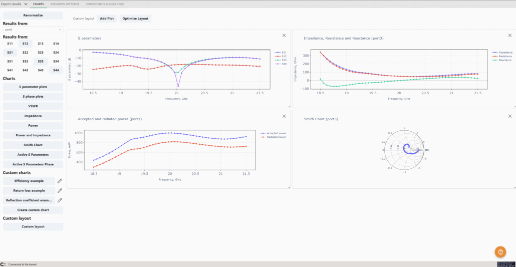
In the CHARTS tab you can view all kinds of results, as well as create custom charts.
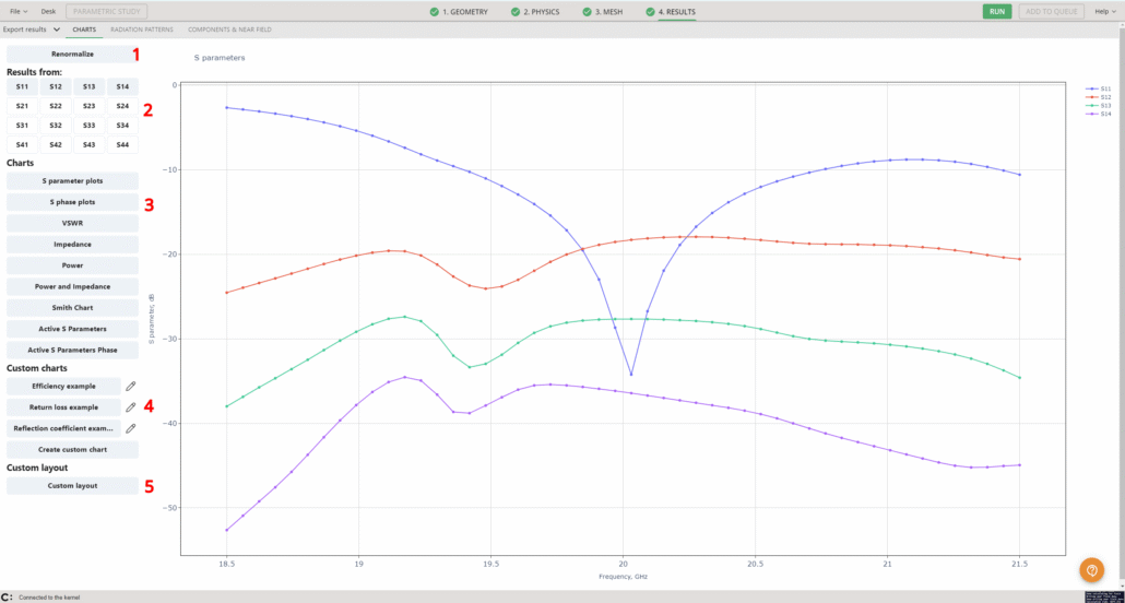
This tab provides access to multiple sections, allowing:
- Renormalization of results as needed.
- Selection of the source of the results being viewed.
- View different charts available.
- Editing of existing charts or creation of new custom charts.
- Creation of custom layouts for the charts to support specific analysis needs.
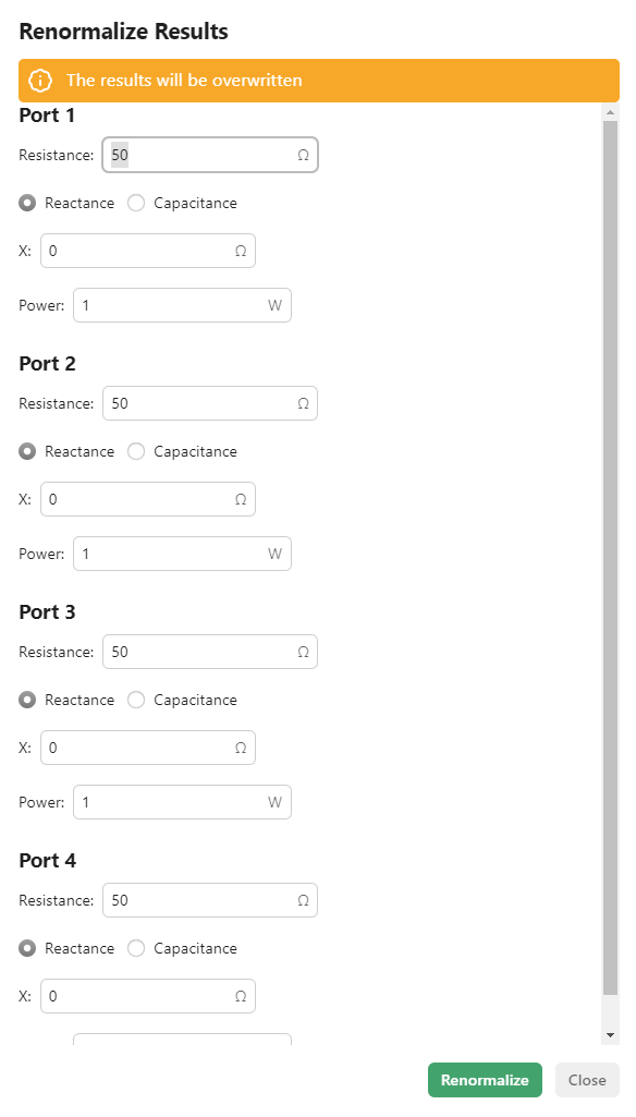
Renormalize
First, results can be renormalized. You can set different resistance, reactance or capacitance values and CENOS will renormalize the results to reflect the new values.
Result selection
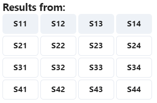
You can choose which results to display in the chart based on the port being analyzed. For example, the S-parameter matrix is easily accessible:
Automatic charts
On the left side you have the menu with chart selections that are:
- S parameter plots
- S phase plots
- VSWR
- Impedance
- Power
- Power and Impedance
- Smith Chart
- Active S Parameters
- Active S Parameters Phase
The S parameters plot is the one that is opened first by default.
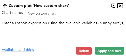
Custom charts
Custom charts can be created, with the following examples provided:
- Efficiency
- Return loss
- Reflection coeffiecient
These charts can be edited, or you can create a custom chart yourself. The custom charts are defined using Python expressions:
Custom layouts
Multiple charts can also be displayed side by side by selecting a custom layout. The positions, sizes, and number of charts can be adjusted! On the left side, it is possible to select the port (if multiple ports exist in the design) for which results are shown, as well as the specific S-parameters to display:
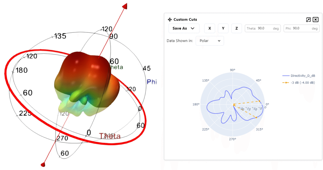
Radiation patterns
The RADIATION PATTERNS tab automatically opens to the directivity visualization. The view consists of multiple parts:
- Renormalization – just like with charts, all results can be quickly renormalized from this section, making it easy to see them under different reference conditions.
- Fields – choose what to display and how, including options such as directivity, gain, and other key parameters.
- Main view positioning – center the geometry, view it from specific planes, rotate it 90°, or switch seamlessly between 2D and 3D views.
- Results filters – focus on the data that matters most to your analysis.
- Scale – rescale the data, adjust colors, and discretize values to highlight important patterns.
- Frequency slider – here you can either use the slider or dropdown to go to a specific frequency, as well as click play and see the pattern changes over frequencies.
Field selection
The left-side menu provides access to the field selection options.
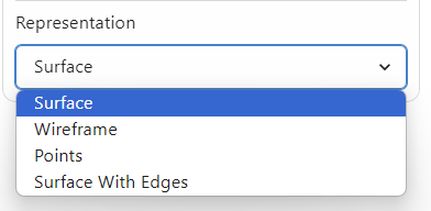
Select a field to display and choose how it will appear: as a full object, a wireframe, points, or a surface with edges.
Once you have chosen the representation, you can see on the right side a scale (number 5 in the image above) – it is possible to modify it as well.
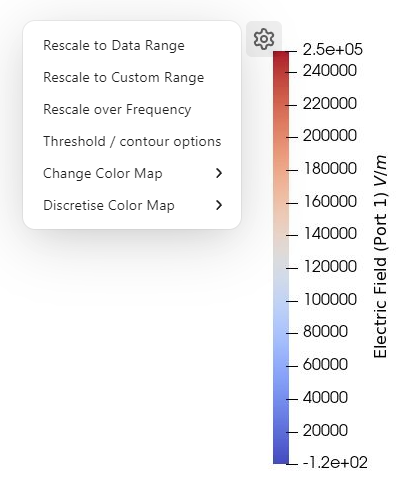
Clicking the gear icon opens a menu with three options for rescaling the values:
- Rescale to Data Range – adjusts the scale to the values at the currently selected frequency.
- Rescale to Custom Range – allows setting your own minimum and maximum values to display.
- Rescale over Frequency – the scale will show all values that have appeared during the calculation.
There are also contour options to help focus on results within specific ranges of interest.
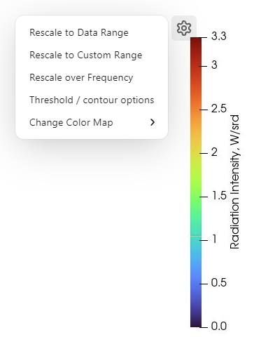
Additionally, the color map is adjustable, you can choose a diferent color map from four preset options.
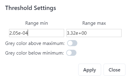
The Threshold/Contour option lets you highlight only the values within a defined range, while graying out all other values for clearer visualization.
Filters
On the right side you can see four filter options:
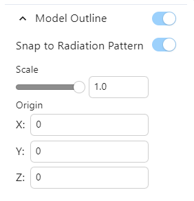
Model Outline
Allows you to toggle whether or not you can see the full model and where it appears:
- on the left side (by default), next to the Field selection;
- on a specific location based on selected coordinates – Snap to Radiation Pattern.
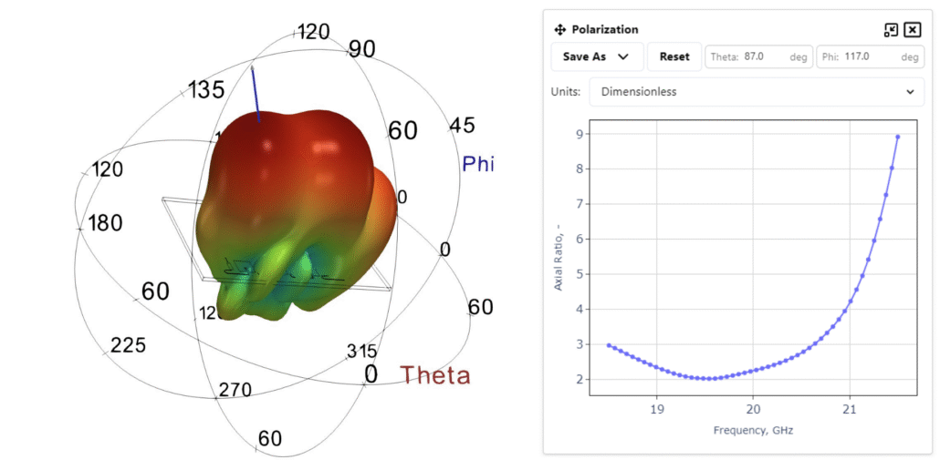
Polarization Filter
Here, the axial ratio values are displayed. A blue vector appears, which can be dragged to inspect the values at different points on the graph.
Theta and Phi values can be adjusted, and units can be switched between dimensionless or logarithmic formats.
Results can also be saved as an image or exported to a spreadsheet!
Custom Cut Filter
This section allows you to explore custom cuts.
Coordinates can be switched between Polar and Cartesian, an axis can be selected, or the cut can be positioned manually by dragging the plane (red circle). Theta and Phi values can also be manually adjusted.
The current view can be saved as an image or exported to a spreadsheet too!
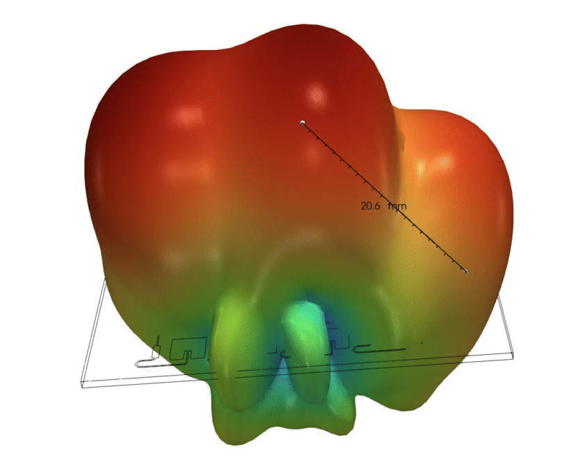
Ruler
When you press ‘Add ruler’, you will see a line with measurements appear on screen. This ruler will also appear on the right side under the filters.
From there you can toggle its visibility, delete it and toggle snap to point.
Snap to Point ensures that when the ends of the ruler are dragged, they automatically snap to the nearest mesh element for precise measurements.
Components & near field
This tab contains the results applicable to the geometry directly.
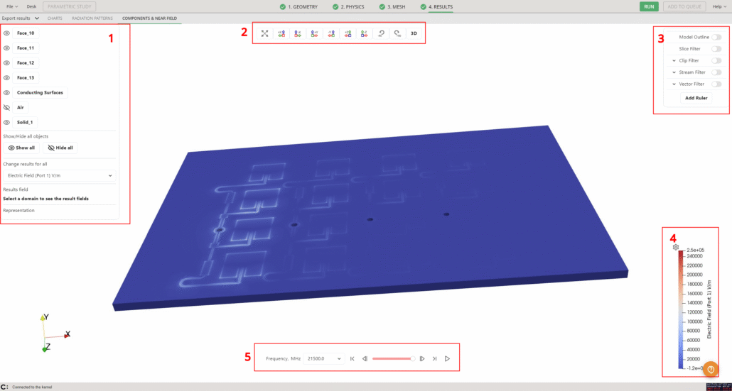
- This section allows you to choose which geometry objects are displayed, how they are represented, and which values are shown, such as Electric Field, Current Density, and more.
- Main view positioning – Easily center the geometry, view it from a specific plane, rotate it 90°, or switch between 2D and 3D views.
- Result filters – Focus on the data that matters most.
- Result value scale – Adjust the scale to highlight important data.
- Frequency selection – Use the dropdown menu to select a specific frequency, the slider to navigate through frequencies, or click the play button to watch the simulation evolve visually.
Results and Visibility
On the left side menu you can see the geometry object selection. There you can toggle visibility for which objects you see by pressing the eye icon.
There are also options to show or hide all objects at once, as well as to select a specific result field to display across all objects.
Clicking on an individual object opens a more detailed menu, where you can choose how the object is displayed: selecting the result field, the port, and the visualization mode. Options include electric field, magnetic field, or a simple solid color representation.
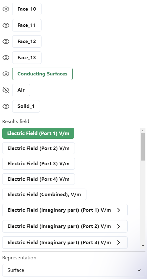
You can also choose whether the object is represented as a full object, a wireframe, as points or a surface with edges.
Once the representation is selected, a scale appears on the right side, which can also be adjusted.
Clicking the gear icon opens a menu with three rescaling options:
- Rescale to Data Range – adjusts the scale to the values at the currently selected frequency.
- Rescale to Custom Range – allows you to define the minimum and maximum values to be displayed.
- Rescale over Frequency – expands the scale to include all values that appeared throughout the entire calculation.
Along with rescaling, a different color map can be selected from four preset options. The color map can also be discretized — setting a higher value (from 1 to 256) creates a smoother gradient and a more refined color visualization.
As before, the Threshold/Contour option is available to highlight only the values within a specific range, graying out the rest for clearer focus.
Result Filters
On the right side, a set of filters is available to support deeper result analysis.
Model Outline
Enables toggling of the model outline, allowing it to be shown or hidden as needed.
Slice Filter
The Slice Filter generates a 2D representation of the geometry along a selected plane. When activated, a popup window appears with the available options.
You can choose the plane by selecting the X, Y, or Z axis, or you can position it manually by dragging the plane with your mouse. After making adjustments, click ‘Refresh’ to update the slice view.
Additional options include saving the slice image using ‘Export slice’, applying a crinkle effect, or modifying visibility settings.
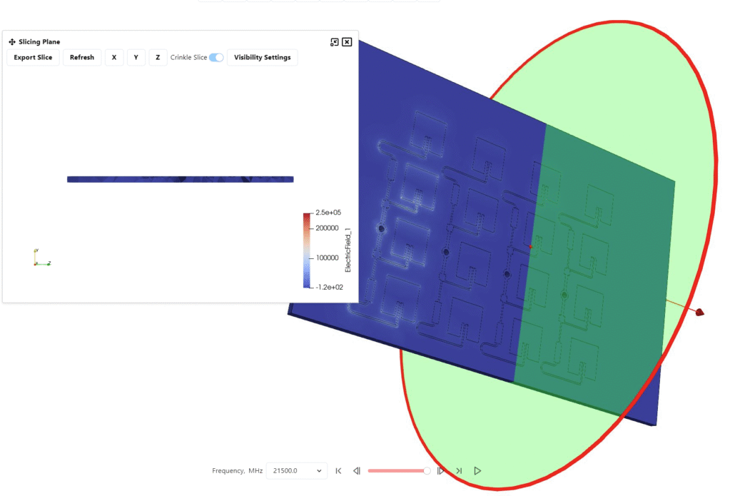
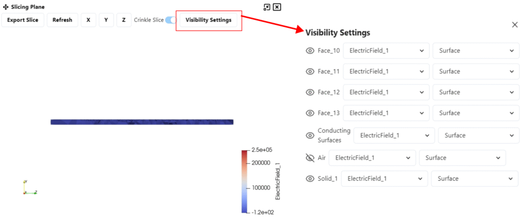
In the visibility settings you can choose which solids and how appear in the slice.
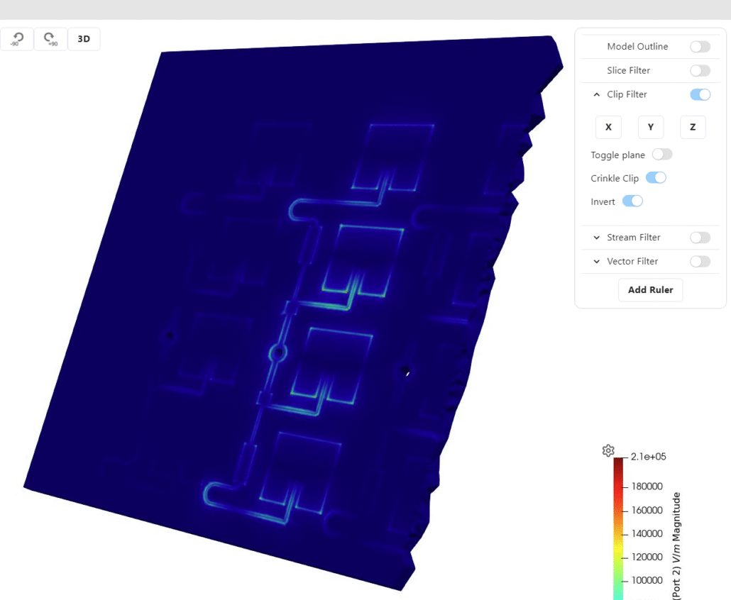
Clip Filter
The Clip Filter allows you to cut through the geometry for a clearer internal view. You can define the clipping plane by selecting X, Y, or Z, or position it manually by dragging the plane. The filter can be turned on or off using the toggle.
Additional options include applying a crinkle effect to the clip and inverting the clipped region.
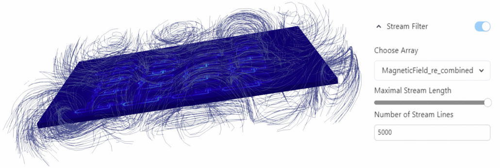
Stream Filter
The Stream Filter visualizes the electric or magnetic field using stream lines. You can choose whether to display the real or imaginary components of the field, adjust the maximum stream length (which determines how far the stream lines extend from the center of the air box), and set the number of stream lines to control how dense the field visualization appears.
A larger stream length fills more of the air box space, while increasing the number of stream lines creates a more detailed and condensed representation of the field.
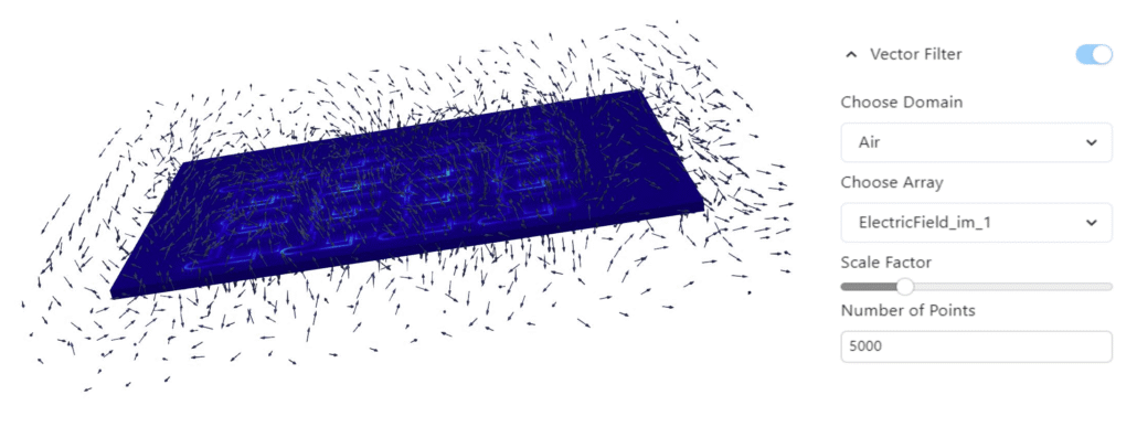
Vector Filter
The Vector Filter works similarly to the Stream Filter, but instead of lines it displays vectors.
You can select the domain in which the vectors are displayed and change the type of result shown, such as electric field, current density, and more.
The filter also allows you to adjust the vector scale factor, which controls the size of the arrows, and the number of points, which determines how many arrows are displayed. Increasing the number of points results in a denser and more detailed vector visualization.
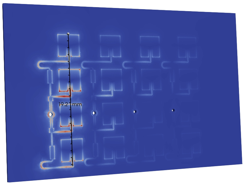
Ruler
When you press ‘Add Ruler’, a measurement line appears on the screen. The ruler also shows up on the right side under the filters. It can be used to take measurements directly on your model if needed.
From the filters, you can toggle its visibility, delete it, or enable snap to point. Snap to point means that when you drag the ends of the ruler, they automatically snap to the nearest mesh element, making measurements more precise.
Export Results
The EXPORT RESULTS dropdown has multiple options:
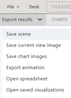
- Save scene: saves the current setup, including applied filters, colors, and other settings.
- Save current view image: exports the current 3D view to the case results folder.
- Save chart images: saves the charts as image files in the case results folder.
- Export animation: saves the simulation animation as a .gif file to the case results folder.
- Open spreadsheet: opens the results .csv file.
- Open saved visualizations: access previously saved visualizations.
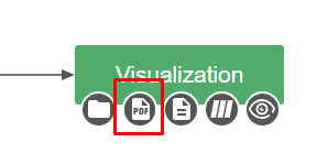
You can also generate a PDF report by going back to the DESK view and clicking on the PDF button under Visualization: